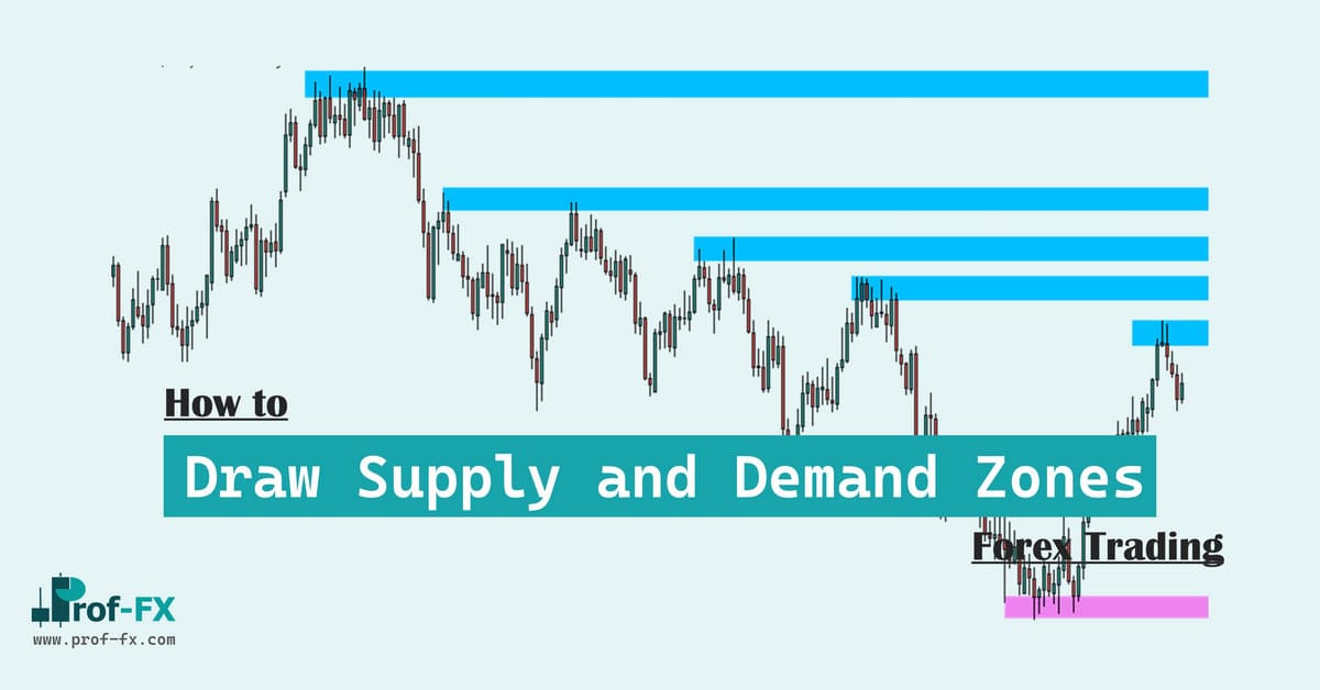
By far, one of the most common questions I get these days is how to trade supply and demand.
Even though the concept is essential to how free markets operate, it has gotten a lot more popular as the basis for trading strategies in recent years.
And it makes sense! Using supply and demand as a part of your trading arsenal can be quite effective and potentially very profitable. So let’s figure out how to use supply and demand in your trading.
What Is Supply And Demand Theory?
Before we discuss anything else, we should define what supply and demand actually is.
In short:
- Demand is how many buyers there are in a given market and how much they are willing to buy an instrument.
- Supply is how many sellers there are in a market and how much they are willing to sell an instrument.
The Laws Of Supply And Demand
Imagine the following scenario: if the price of EURUSD increases, there will be more people willing to sell because it will make them more money, right? This is the law of supply: the higher the price, the higher the quantity that is supplied.
Now, imagine the scenario from the point of view of the buyers. Whenever something becomes cheaper, you will be more interested in buying, right? On the other hand, if the price increases, you’ll be less and less interested in getting it. This is the law of demand: the higher the price, the lower the quantity demanded
Apply Supply and Demand in Forex Trading
Supply And Demand Price Dynamics
Given all of the above, we can draw a few conclusions. The first one is that when there is more demand (buyers) than there is supply (sellers), the price will go up.
Secondly, when there is more supply (sellers) than there is demand (buyers), the price will go down.
Finally, when there is as much supply as there is demand, the price will stay the same. In this case, we talk about supply and demand market equilibrium.
With these dynamics in mind, we can view any chart as a balance or imbalance between supply and demand:
Let’s go over this example. At Point (1), we can see that there is a small area with Doji candles. The price doesn’t seem to move a lot because essentially, supply equals demand. This changes at Point (2) because there is more supply than demand, driving the price sharply lower. At Point (3), we see some stability again where roughly, supply equals demand, forcing prices to stay the same.
At Point (4), we see that the price breaks out from this area again and starts rallying. There is more demand than supply here, meaning the buyers are in control. At Point (5), this dynamic changes again and we see a lot of sideways consolidation but eventually at Point (6), the sellers step in and move the price lower.
The price takes a breather at Point (7), meaning that there again is a supply-demand equilibrium, before pushing the price further down at Point (8). At this point, there is more supply than demand.
Supply And Demand Zones
Given what we discussed before, we can view any chart as a sequence of zones where there is supply and demand equilibrium with supply and demand price imbalances in between.
Let’s focus on these zones in particular. Especially, the zones where the price is moving away from with a lot of momentum are interesting to us because whenever that happens, it’s a sign that the balance of supply and demand has shifted in a very substantial way.
Supply and demand zones are the origins of these price moves.
We can also use the following narrow definitions:
A supply zone is a horizontal price area at which a lot of sudden selling has occurred. This resulted in an imbalance between supply and demand, where supply greatly exceeded demand, pushing the price down.
and
A demand zone is a horizontal price area at which a lot of sudden buying has occurred. This resulted in an imbalance between supply and demand, where demand greatly exceeded supply, pushing the price up.
Here’s an example of supply and demand zones in action:
We can see how the supply zone shows a narrow consolidation (= supply and demand equilibrium) and all of a sudden, the price shoots out to the downside with a lot of momentum.
We can also see a demand zone with again, a narrow consolidation, from which a strong move up happens.
Here, we can see another example of an area of consolidation and the price moving strongly away from it with a lot of momentum:
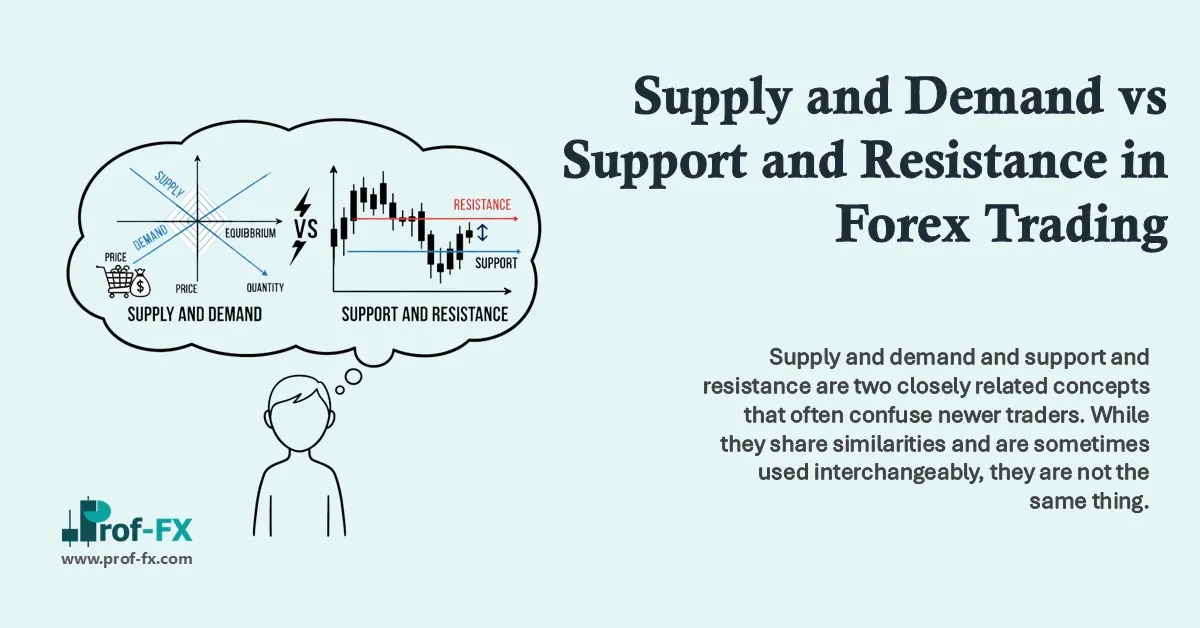
Supply and Demand or Support and Resistance?
I often get asked what the difference is between supply and demand and support and resistance. In practice, you’ll often see that they are one and the same, but the way we determine them is different.
When thinking about support and resistance, you should imagine these zones as boundaries. They are areas on the chart where the price couldn’t break through and instead, bounced off from.
When thinking about supply and demand, your first thought should be on buyer and seller imbalance in Forex. In many occasions, the strongest buyer-seller imbalance is exactly at support and demand areas, but the driver of these forces is different.
Another difference is that supply and demand is often a leading indicator. While traditionally, support and resistance levels are only called as such after at least two tests, this is not the case with supply and demand. You only need a supply or demand zone to be created in order to plan a potential trade.
Eventually, what works best is if you can use both concepts together. One is not better than the other but both have benefits and drawbacks.
The 4 Supply And Demand Patterns
Before we get into learning how to draw our supply and demand zones, it’s useful to know that there are roughly 4 types of supply and demand, defined by how the price approaches the supply and demand zone and how it leaves the zone again.
These 4 types are:
1. Rally – Base – Drop
The first type of supply and demand pattern is called rally – base – drop. It happens when we see a rally to a certain zone, followed by a short consolidation and then a strong bearish move away from this zone again (the drop).
In this supply pattern, we’re looking for supply areas that we can see a strong bearish move away from. Here’s a chart example:
2. Rally – Base – Rally
The next supply and demand chart pattern is called rally – base – rally. This pattern happens when we see a rally to a certain zone, followed by a short consolidation which forms the base and then a further rally up again.
In this demand pattern, we’re looking for demand areas inside a trending market, from where we can see a strong bullish move from. Here’s an actual chart example:
3. Drop – Base – Rally
In the drop – base – rally pattern, we are looking for a bearish move (the drop) towards a demand zone where we see a short consolidation (the base), before the price turns around and rallies strong (the rally).
In this demand pattern, we’re looking for the low of the preceding downtrend, from which we can see a strong bullish move back up. Here’s a chart example:
4. Drop – Base – Drop
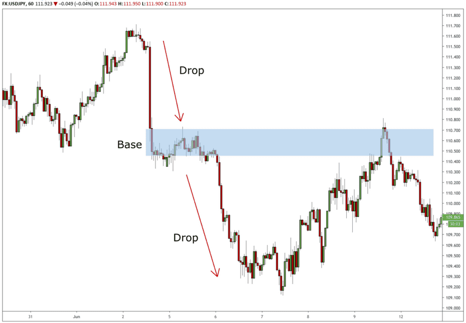
Finally, the drop – base – drop supply pattern shows the price in a downtrend, after which we can see a consolidation zone where the price takes a breather. After this, the price continues with a strong bearish move and further extends the downtrend.
In this supply pattern, we’re looking for supply areas inside of a bearish downtrend, from where the price continues down in a strong way. Here’s an actual chart example:
Drawing Supply And Demand Zones
Now that we know what supply and demand zones are and how the 4 different types of supply and demand zones can be identified, how exactly can we draw them? I use the following steps to identify supply and demand:
1. Find the Momentum Drive
In step one, we’re looking for a large price move. Long, successive candles in one direction work the best. Just open any chart and it shouldn’t be too difficult to find those. Here’s an example:
On this chart, we can see in four different occasions that the price made a strong move with successive candles in one direction.
Both the momentum (how fast is the price moving) and the absolute distance (for far did the price move before it stopped going in that direction) are relevant here. Of course, the best price moves show both momentum and a large absolute distance.
Trend Considerations
Another thing that plays a role is the overall trend direction. The best demand levels often happen after the price has been in a long downtrend, while the best supply levels often happen after the price has been in a long uptrend.
Why is that? The easiest analogy would be to think of the trend as a train in motion. The faster the train goes, the more force is necessary to make the train stop and reverse, right?
So if the price is in an uptrend, it will take much more sellers to make the price drop back down in the opposite direction. Conversely, when the price is in a downtrend, it will take much more buyers to make that downtrend stop and reverse. Let’s understand this with an example:
In the above chart, we can see a tight consolidation, after which the price sells off strongly. While this looks like any other good supply zone, we should also consider the overall trend direction:
See how this supply zone was created in a downtrend? Given that the overall trend was down, it would require fewer sellers to push the price lower because everyone was looking for shorts already.
When we look at the extension of this supply zone, we see how it didn’t hold on the way back up and instead, the price just moved through it without too many problems:
2. Find the Base of the Momentum Drive
After we have found the momentum drive, we should define our base. With the base, I mean the price area just before the price exploded in one direction. Often, you will see a small consolidation before this happens and it’s that consolidation that we are looking for. Especially, we’re trying to find the following:
- the consolidated bearish price action before a bullish price move
- the consolidated bullish price action before a bearish price move
Because it’s exactly this area that is responsible for the resulting move:
The base of a supply or demand zone is where the orders were placed that were responsible for moving the market in such a strong way.
Let’s apply this knowledge to our chart:
As you can see, I’ve marked the base for each of the strong moves we identified on the chart.
3. Refine the Base
Are we using the candle body for this or including the wicks as well? What are the upper and lower boundaries of a base?
The answer is it depends. While this is subjective, I have four things that I keep in mind while refining the base, that might help you too:
A) Size of the base
When the price action in the base is rather narrow, it often makes sense to include the wicks in this. Then again, when there’s a large spike, it might be ok to leave this out of the base.
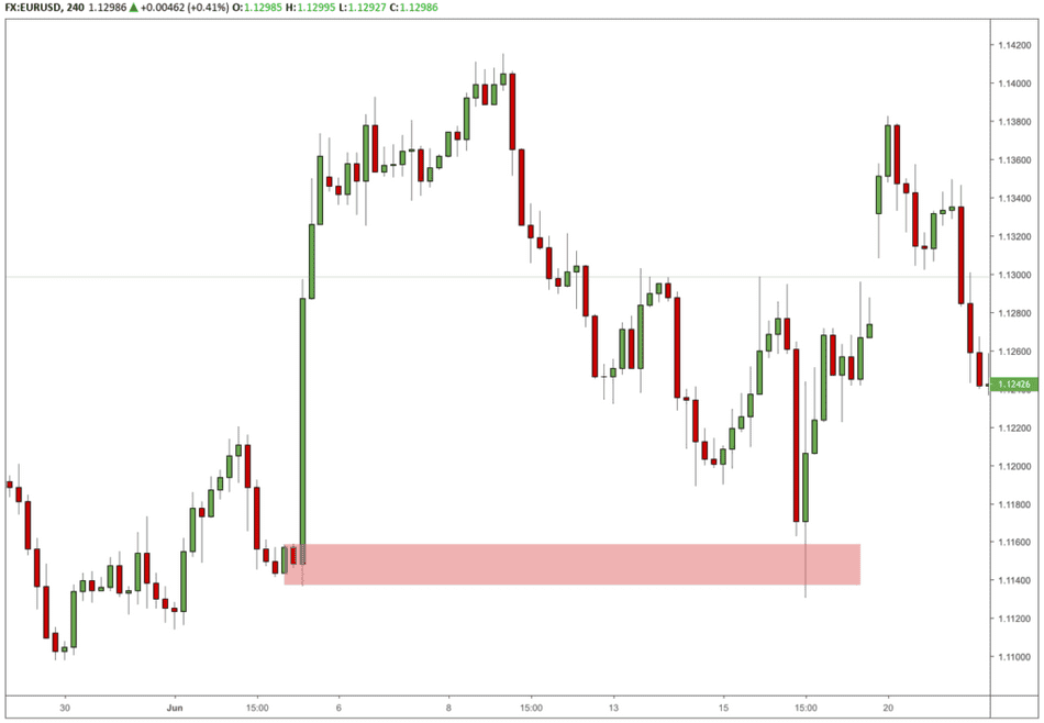
B) Amount of consolidation at the base
When there is a tight consolidation period before the momentum drive, it makes sense to use the upper and lower boundaries of that consolidation as the base, regardless of whether this includes wicks or not. After all, that is where the orders were created before the momentum drive:
C) Confluence with other price action
In certain instances, we can line up certain supply and demand zone boundaries with previous support or resistance, swing highs or lows or other levels. This kind of confluence can be meaningful to find a better definition of your base:
In the above chart, we can see how the upper boundary of the demand zone can be made narrower since it lines up pretty nicely with previous support and a swing high spike. It ended up being pretty perfect demand area, as the price just briefly dipped in the area and then shot up again.
4. Extend to the right
Finally, we extend the base to the right and voila, we have our supply and demand levels! Here’s how that looks on the chart we were annotating earlier:
By now, you might also have noticed that something else happened: with almost every one of our supply or demand zones, the price eventually revisited that area and, for the second time, moved away in a strong fashion. Which brings us to the next point.
Supply And Demand Trading Patterns
The Supply And Demand Bounce
When you look at the above charts, can you see that some pattern seems to keep occurring after a strong move away from a supply and demand zone?
That’s right, after that strong momentum drive, we often see a pullback into that same supply or demand zone. Not only that, there’s a clear reaction as well, where the price seems to bounce from this level on the retest. This is the first Trading Forex supply-demand strategy pattern you can use with supply and demand. Here’s another example on gold:
We can see how the price shoots up from a narrow consolidation on the left of the chart, creating a demand area. When the price eventually returns to this zone, we can see a quick dip into the demand area, after which the price moves up again.
Before we go on, I want to talk a bit about WHY this happens. After all, any supply and demand strategy can make much more sense if you don’t just understand how but also why. And this is where Forex Market liquidity comes in.
Liquidity Patterns
In order to understand why supply and demand zones can work as the basis of a trading strategy, we need to look at how buyers and sellers behave around these zones. A lot of this comes down to finding liquidity.
Liquidity describes how easily an asset can be bought or sold.
When there is a lot of liquidity, we say that the orders can easily be absorbed by the markets. It means that there are many traders willing to take the other side of your order.
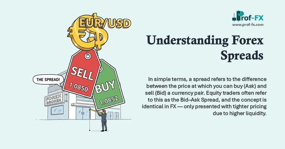
When there is little liquidity, it might be harder to get your orders filled. Because there might not be enough traders to take the other side of your trade at the price you want, you might get filled at a worse price than expected. The risk you assume is called market liquidity risk. Another common symptom of illiquid markets is that they have a bigger spread.
It also makes sense that the bigger your orders are, the more liquidity might be an issue. This is why some institutional traders use special techniques to get a good price for their order.
Order Slicing
Whenever institutional traders need to open a position, they do so with much larger size than the average retail trader. In fact, their positions are usually so big that if they were to simply enter at once, they would move the market considerably.
So what do they do? Many of them will employ something called order slicing, where they split up their single order into multiple parts and only execute those in the market once enough liquidity is available.
Institutional traders entering many orders at liquidity
This is creating the consolidation patterns before a momentum drive.
Whenever institutional traders need to enter a large buy order, they will do so part by part, waiting for the price to come down before pushing the next “slice” on the market. That creates patterns on the chart and the more you trade supply and demand, the more you will “see” the underlying dynamics of certain patterns that happen before supply and demand momentum drives.
Liquidity Accumulation
The second aspect is that institutional traders understand where liquidity is accumulating. As you might remember, we can see liquidity as orders on the opposite side of your trade. So where can they find that?
- Above significant swing highs
- Below significant swing lows
Let’s take the next chart as an example. The institutional trader is looking for enough liquidity to get a fill on his big order. He wants to go long but so he needs to find traders who want to sell their position to him.
Below the swing low, there will be lots of that liquidity: first, you will have the stop losses of buy orders, which will sell on the market once they’re hit. Additionally, there will also be traders who go short, again adding liquidity to the market.
This is why you will often first see a spike in the opposite direction at the origin of a strong price move. The Liquidity Spike is the pattern that gets created when large market participants need liquidity and move the market in order to get it.
Retail traders get trapped, their stops get hit and they will often talk about “stop hunting” while in fact, this is nothing more than normal market behavior.
Why the Supply And Demand Bounce Works
Using the previous chapter on liquidity, we understand what is creating both the consolidations and the momentum drives that creates supply and demand zones. But why is the price bouncing from our zones when returning to those same zones?
Reason 1: Institutional buying and selling
If there was an institutional trader (either a bank or hedge fund or anything else) who made the price move so strongly that it created a supply or demand zone, what really happened is that the liquidity around that price dried up.
This means that there wasn’t anyone left taking the other side of the position and this made the price move in a very strong way. However, it’s very likely that this institution also wanted to take a bigger position than it actually could. So what happens when the price returns to the level they were initially taking a position?
That’s right, they get in the market for a second time. In turn, this moves the market again, which is what drives the supply and demand bounce.
Reason 2: A Perfect Profit Taking Area
As we discussed earlier, the price always moves from one supply/demand balance to the next supply/demand balance. This means that for every trader that is waiting to enter at the supply or demand zone bounce, there’s another trader that is already in a position and dying to find a good spot to take profits.
So guess where they are looking to take profits? Exactly, the same supply and demand levels that we are looking at!
Reason 3: Cutting Losses on Higher Timeframe
Imagine for a second the following demand zone. We could see the price briefly dipping lower and then shooting up. Then on the return, we could see the price bouncing strongly back up again:
That was a 1H chart. Now look at the same instrument on the 8H charts. Imagine that at this demand zone, someone took a short on the 8H. Immediately, the price turns the wrong way and the trader is at a loss.
What happens is that whenever the price comes back to the entry points, it gives the trader an opportunity to get out of what he thinks is a bad trade, for a break-even result. That was close!
Of course, when all these traders are covering shorts, it means that a lot of buy orders are flooding the market, again pushing the price back up.
The Myth of Pending Orders from Institutional Traders
I often read that the reason that supply and demand zones show a reaction on the retest is because of pending orders of institutional players. While it is true that institutional positioning drives price action around these price levels, it simply doesn’t happen with pending orders.
The question you need to ask is: why would they want to do this instead of just using market orders? There is zero benefit in doing so and limit orders give the institutional traders at least two disadvantages:
1) it gives away their positioning for no good reason
Whenever a trader creates a pending order, this shows up in the order book. In most cases, those add liquidity to the market. It also gives an indication to other traders about how they are positioned, which is not necessary and doesn’t happen if they simply use a market order.
2) they don’t yet know what size could be absorbed by the market
Imagine that you have a really big order. As we discussed previously, the institutional traders will use specific techniques to make sure the price doesn’t move too much when these orders enter the market.
However, they don’t yet know how much liquidity will be available in the market around those zones so it doesn’t make sense to add pending orders yet. Any institutional trader will first need to observe the order book to see what size he could put on around these zones. Using pending orders would simply pose a risk that the market moves away too much.
Trading The Supply And Demand Bounce
So finally, once we’ve identifier a good trading opportunity, how do we enter these supply and demand bounces? There are roughly two ways and I’ll briefly go over them here.
But because this is an aspect of trading supply and demand that can be quite complex, I will keep some of the techniques I use for a future time. Needless to say that the way you trade these patterns can make the difference between profits and losses, even though supply and demand zones by themselves can already give you a potential edge.
1. Immediate Entry
The first way to trade supply and demand is to use an immediate entry, meaning that you just place an order in the supply or demand zone and whenever that order is filled, you’re in a trade.
The benefits of this is that it’s less likely you’ll miss a trade because you can create a pending order beforehand. The drawback is that you might risk that the level doesn’t hold at all and instead end up with a loss. however, if you have defined quality supply and demand zones, this will still work very well.
2. Delayed Price Action Entry
With this technique, you wait for price action confirmation. This confirmation can come in many ways but the general idea is that you want to see in some way that the supply or demand zone is acting as a barrier and blocks the price from going through it.
This entry technique can easily fill an article of its own but popular ways of finding “confirmation” are:
- Engulfing bars
- Inside bars
- Fakeout spikes: bars with highs or lows beyond the zone but still closing inside the zone
- Opposite direction breakouts
Here’s an example of how you can enter at the close of an inside bar at the supply zone:
Stops And Targets
Even though this can be done in a mechanical way, choosing stops and targets is probably the most subjective topic of trading supply and demand.
Part of the reason for this is that it also depends on who you are as a trader: do you like to have a high win-rate strategy with a low reward to risk ratio, or do you prefer a low win-rate strategy with a high reward to risk ratio?
This is a question that only you can answer, based on how many losses you can stomach. Needless to say is that a strategy that goes for 10R profits (what is R?) per trade, will have more losses on average than a strategy that goes for a 1:1 reward to risk.
That said, here is a good pointer:
Take into account volatility when determining stops
An indicator such as ATR can give you an insight into how volatile an instrument is and as such, can help you with determining how wide your stop loss should be. For example, we could choose to use a stop loss that is twice the 24-period ATR of the entry candle:
Conclusion
Supply and demand is at the core of what trading is all about, so it’s not surprising that it can form the basis of a powerful trading strategy.
The first step in trading supply and demand is understanding what it is, how it works and what drives price action around these zones. While only introductory, the aim of this article was to shed some light on this and I hope you found it helpful.
Supply and demand is easily so extensive that a book could be written about the topic. However, it’s also important to prevent misinformation from spreading so understanding the basics of supply and demand is where everything starts.
The next step for you should be to go out and look at charts. Identify the supply and demand areas and see how the price behaves around these areas. Observe, make notes and build your experience.
If you want me to write more about supply and demand and how to trade it, please leave me a comment on this article. Or if you simply enjoyed my article, feel free to let me know as well.
Good luck in the markets!

